We are excited to share the new PUM visual identity and website with you!
The new PUM
PUM is an impact-driven organisation with knowledgeable, committed and entrepreneurial people: Professional people for positive impact. We are a liable, trusted organisation that has collaborated with over 40,000 business worldwide in the past 45 years. That is why we continue with the name PUM. However, the world is changing, and so are we, as reflected in our new WHY: “We empower ambitious entrepreneurs in building a structurally better future for their community; socially, ecologically and economically.” And in our values: impact driven; equality, commitment, and expertise. This WHY and the values are now expressed in a rebranding, updating our logo and visual identity.
The visual identity is the sum of all expressions, in form and language, that manifest the PUM brand. From logo to colour use and from typography to imagery. Our visual identity is essential to make a good first impression and also contributes to developing and maintaining relationships with all target groups. Consistent application of our visual identity ensures recognition and reliability.
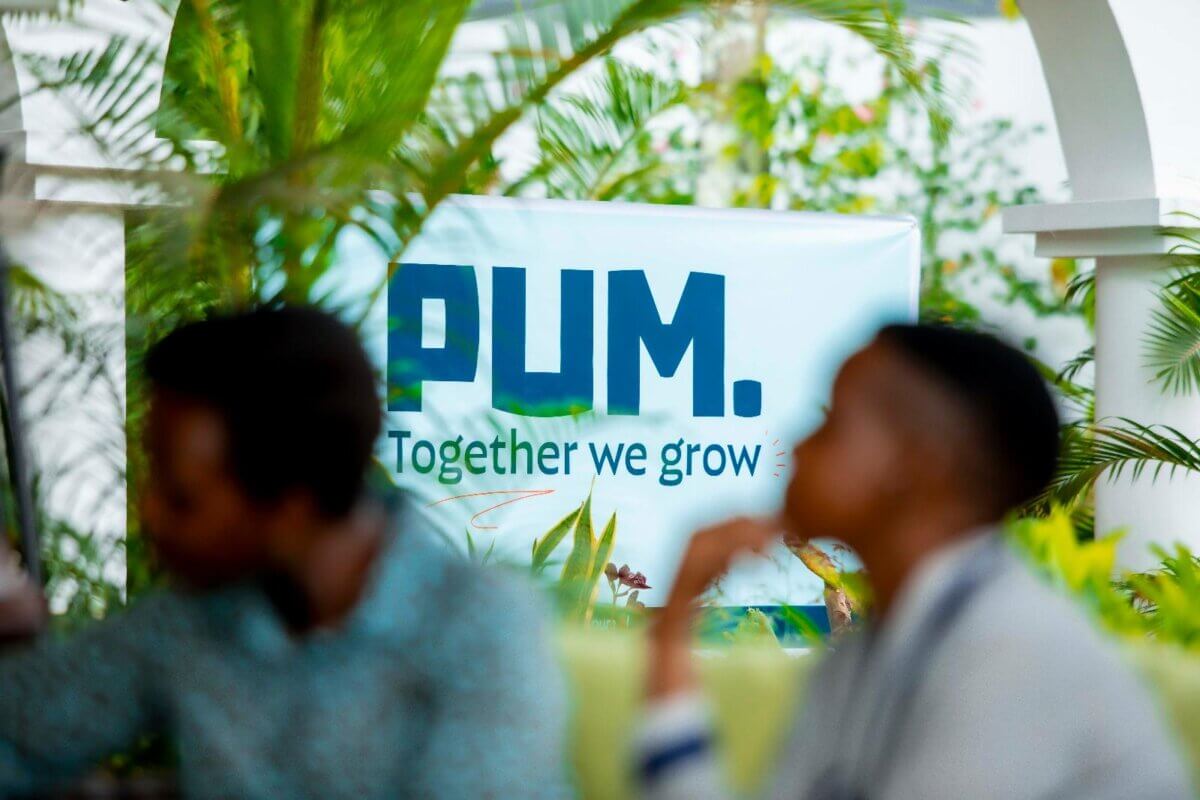
We are PUM. With a dot. To reinforce our name and our actions, to add strength. Our logo is powerful, clear and distinctive. Just like the people we work with and for. This means that ‘Netherlands senior experts’ disappears from the name and the logo. We present ourselves as just PUM. A strong and clear brand.
The pay-off is ‘Together we grow’, the essence of what PUM stands for. PUM believes in the power of collaboration, and in the magic that happens when diverse perspectives meet. When bringing together unique expertise, all pursuing the same goal, solutions that no one had thought of before are generated. Creating value that cuts through borders and benefits everybody involved. PUM. Together we grow!
Scrolls through our website and explore the new PUM!


